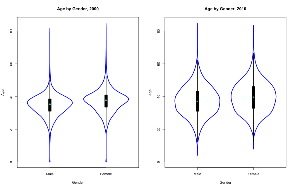
Wider distribution of age over time
In this graph, we see that the median ages of both genders increase in 2010. Also, the distribution of ages in both genders is more evenly distributed in 2010. The more even distribution of gender may be caused by more people moving into St. Louis from surrounding suburbs, so as more people move back, distribution evens out. The increase in median ages over time may also be caused by people moving into St. Louis from surounding suburbs. As people who live in suburbs tend to have families, they also tend to be older. This group of older people moving into the city may be part of the reason for this increase in age. I could have plotted this using a density plot. This would have made it easier to compare density of ages for all four groups as they would be layed on top of each other. But I would not be able to compare quartiles and medians -- which are useful information, as I can do with the wvioplot. I chose to use wvioplot for showing age distribution over time. Particular because I wanted to compare median ages, I felt wvioplot plots median very clearly and displaying density distribution would be a plus and tell something interesting. A negative of using a wvioplot is that I can't overlay the plots, which makes comparing densities more difficult.
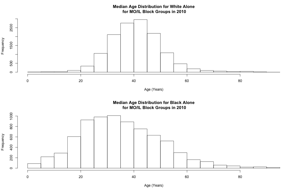
Lower and More Variable Median Age for Blacks Compared to Whites
We see that distributions of median age are both unimodal and skewed to the right. Median age of White people is centered around 40-45 which is higher than that of Blacks around 30-35. The distribution for Blacks appear to have a larger variance than that of Whites. Thus, we expect the median age of Whites to be older and more variable than that of Blacks across block groups. The age gap of approximately ten years is on par with the national average. Thus, the plots might be an indication of the aging of White population compared to Blacks and likely other minorities. We also observe that there are far fewer block groups reporting Black median age than White median ago, and note the White dominance in the two states of interest. Thus, the much higher variance in Black median age might partially be a result of the limited number of Blacks in some block groups.
We chose to visualize the distributional differences with two histograms with identical x-axis ranges. Histograms can not only capture the distributional features, such as modes, shape and variance, but also offers exact frequencies in each bin. Due to the disparity in the number of block groups reporting Black median ages versus White median ages, the frequencies are useful in our case. The main disadvantage of a histogram is its dependence on the choice of the number of bins. We have the option to counter the problem with an average shifted histogram. Other alternatively to histograms include multiple density plots, bean plots and violin plots, but none of those offer insight into the sample size differences between categories.
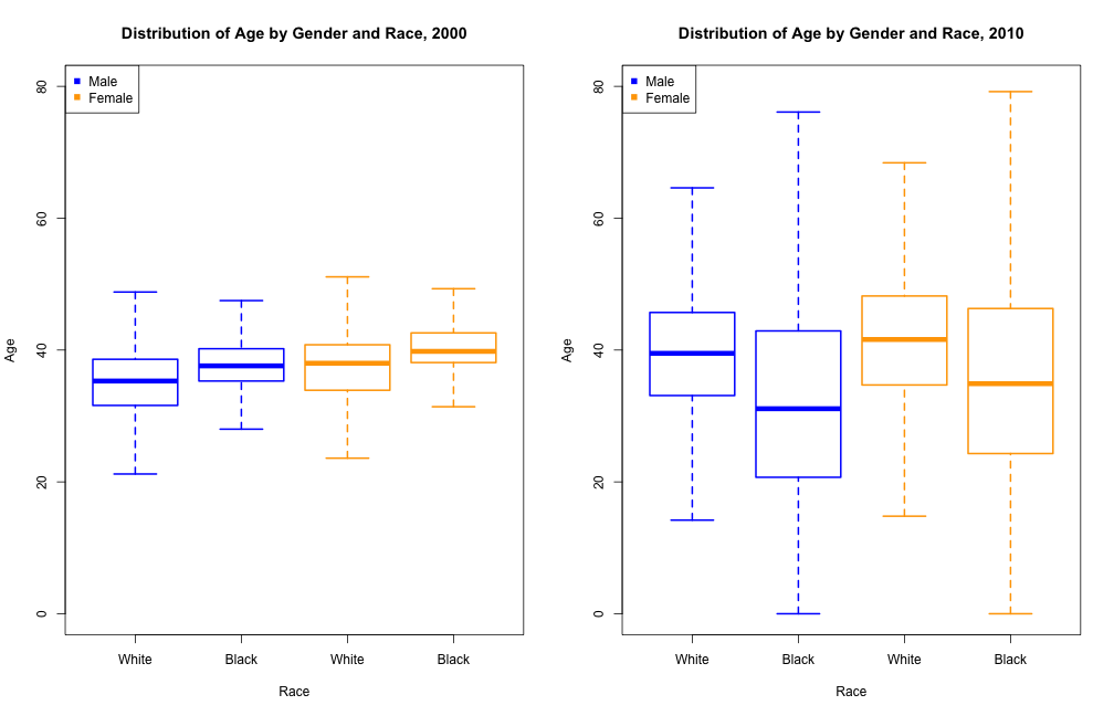
Patterns of age by race and gender change over time
In this graph, we see multiple things:
- In 2000, median female ages tended to be older than that of males males and the black population tended to be older than the white population.
- In 2010, this pattern is opposite. Females tended to be younger than males and the black population tended to be younger than the white population.
- The black population in 2010 seems to be more widely distributed in terms of median age.
An explanation for why in 2010, the black population tended to be younger is because of the increase of gentrification over time in St. Louis. As rent, taxes, and housing prices increased, many black people were evicted from the city. Also, as housing and urban development became nicer, wealthier and therefore older, white people started moving into St. Louis. An explanation for why in 2010, the black population seems to be more widely distributed in age is because perhaps black population decreased, as more were evicted or could not afford living prices, so the quartile ranges or larger.
I could have plotted this using a histogram, which would show density clearly and would be easy to compare different densities if I chose to overlay histograms by gender and race. However, I would not have been able to compare median ages, which is what I wanted to show, as the data I used is a collection of median ages. I chose to use a boxplot because it shows the quartiles and distribution of ages very cleanly so it is easy to compare boxplots. Also, I can choose the color for each boxplot something I can't do with wvioplot which makes it easy to separate different races by color on the graph, which overall, makes the graph easier to read. A negative of using the boxplot is that I cannot show the density of the data, which could have possibly been interesting to see, but since I already used wvioplot for age and gender, I already showed that age distribution tended to even out by gender in 2010.
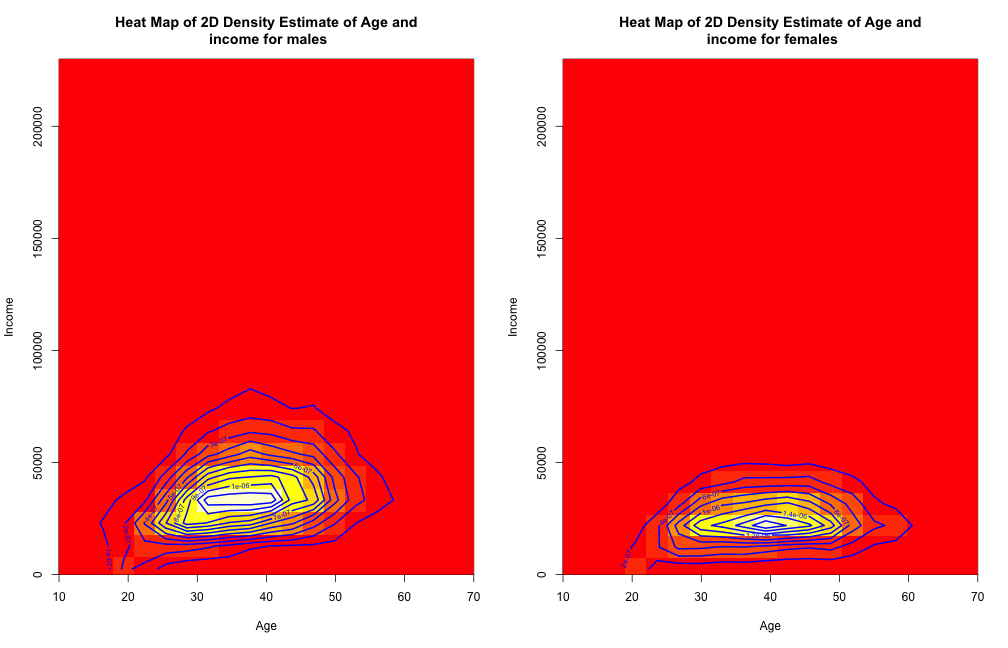
The density of income and age for men vary more than for women.
When addressing the relationship between age and income by gender, we find that the heat maps indicate a similar structure for both genders, with modality at age around 30-40 for males and 35-45 for females, and modality for median income around 30000 for males and 25000 for females. We also notice that the densities for higher median income (more than 50000) is much higher for males than for females, which can be seen by the countours, since the countours for males tend to have a larger range than that for females. This indicates that the median income and age, mostly for income, of men have a higher variability than for women, whom are more centered and stable.
The heat map shows the density relationship between two variables by a color scheme that highlights the modality of the observations. It can give a very easy interpretation and is easy to compare between gender. Alternatives could be a choropleth, which would have an extra feature of geographical location, but it would be harder to add a second variable by introducing a different color scheme in order to find the distribution between the two variables of interest. Another alternative is the scatterplot and fitting nonparametric models on top, but since we are focusing mostly on the distribution of the two variables rather than the influences on each other, this would be hard to read off the scatterplot. The heat map also has disadvantages, such as the difficulty to observe the densities apart from the modes. This could be approached by changing the bandwidth from the default, which I have used in this case, to a larger value, but this might cause some distortion of the data itself.
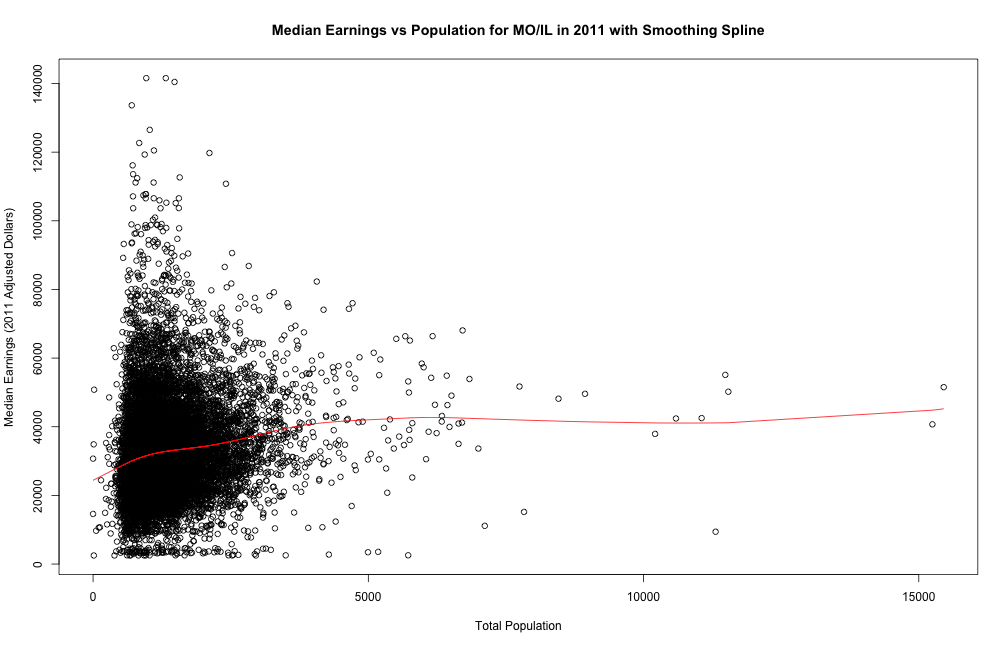
Positive Correlation between Total Population and Median Earnings in a Block Group
We see that the majority of block groups have total population less than 4000 and median earnings less than 80k. The smoothing spline suggests a positive correlation between total population and median earnings. In other words, the larger population a block group has, the higher median income it is expected to have. We expect block groups with large populations to be urban areas, while those with small populations to be suburban and rural areas. Thus, the positive correlation fits our expectation that urban areas tend to have higher median income than rural areas.
We chose to study the bivariate relationship with a smoothing spline (default parameters). A smoothing spline aims to minimize both the sum of squared errors and a penalty for curvature. Thus, it gives a smooth curve reflecting local trends and is very useful in our study. Disadvantages of smoothing spline includes its dependence on parameters such as the penalty weight and its lack of representation of sample size. To fix the latter problem, we add a scatterplot of data points to visualize the significance of the curve in different regions as well as spread along the curve. A similar alternative would be a LOWESS curve. A 2-D conditional density plot may also be useful, but it is difficult to incorporate sample size/data points information.

Lower and Less Variable Income for Females Compared to Males
We see that distributions of median earnings for both genders are unimodal and skewed to the right. Median earnings of females is centered around 20k which is lower than that of males around 35k. The female distribution also appears to be more centralized with smaller than variance across block groups than the male distribution, which has a wider modal region. The right skewness fits our expectation that most block groups fall within the average median income range, with a few high-income block groups in urban areas. The gender difference also fits the national pattern that females are expected to have lower median income than males. Interestingly, it also appears from the plots that females also have a smaller variance of median earnings across block groups than males.
We chose to compare the two distributions with two density plots with identical x- and y-axis ranges. Density plots are useful for visualizing the features of 1D distributions. Putting two density plots together allows us to quickly identify differences in distributional features, such as modes, shape and variance. Disadvantages of density plots include its inherent dependence on bandwidth parameters and its lack of sample size representation. Similar alternatives include bean plot and violin plot. We could also use a set of two histograms, but improper bin choices of bin sizes might hide useful distribution features.
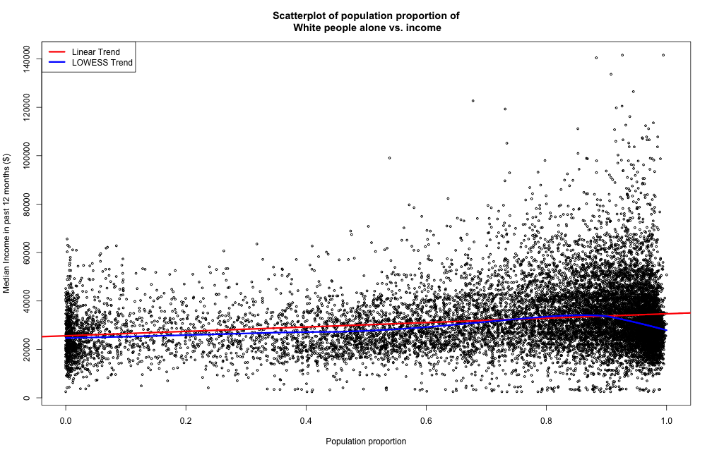
The median income increases for higher population proportion of White people.
The first plot indicates that the most of the blockgroups have more than 80% of their population as White people. Also, the number of blocks with a population proportion of White people less than 10% is much greater than the blockgroups with such a proportion between 10% and 50%. The linear and lowess trend do not show strong constrasts in structure, indicating that the relationship between the population proportion of White people and the median income is close to a linear structure. A positive slope of the trends show that we expect an increase in median income of a block for an increase in population proportion of White people. The magnitude of the slope is small in maginitude, as we expect an increase of around $9000 in median income for a population of all White people compared to none White people.
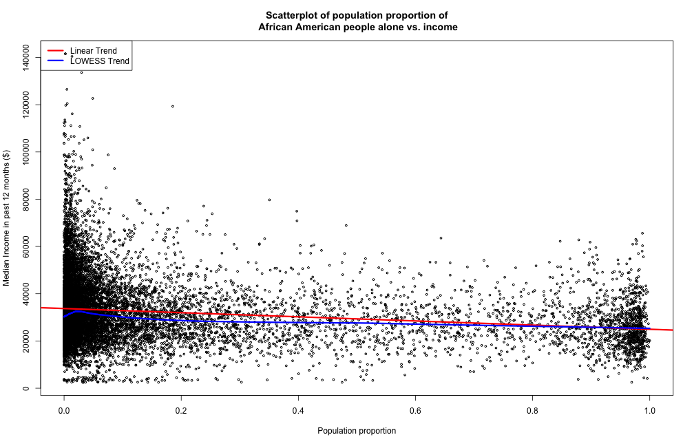
The median income decreases for higher population proportion of African-American people.
The second plot shows that the majority of the blockgroups have a low African-American population proportion, as the scattered points are close to 0%. The regression curves both indicate that the relationship is close to linear, for population proportions greater than 10%, and the slope indicates a decreasing trend for median income associated with an increase in African-American population proportion. Since the population of St. Louis is almost consisted of only Caucasian and African-American, it consists with our intuition that the slope of the linear trend is almost the exact negative of the slope for White population proportion.
A scatterplot shows the distribution of the proportion of people by race, and gives a direct implication about distribution of observations in each range. However, for large data sets like these, it would be hard to compare from different ranges as the modality of the observations as the number of points in each range is relatively large for the human eye to have a precise comparison directly. The advantages are that the LOWESS and linear model both can show a relationship between the two variables of interest, however they might cause problems when the true relationship is not necessarily polynomial or linear. The bandwidths are chosen by default, so that the model will prevent overpredicting or being too unadaptive. Alternatives could be choropleths or contour maps, however they might be harder to interpret the relationship between the models, but have extra features such as location and density distribution.
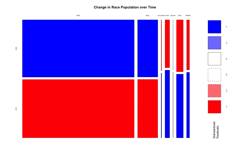
All populations increase, some slower than others.
While each race's population increased, we can see that the proportion of whites and blacks decreased over time. There are a high number of factors at work here, including the birth rate and immigration/emigration, so hazarding a guess as to why this is occuring may differ for each race. For example, from the previous graphs, we can tell that Whites tend to be richer and therefore should have a lower birth rate within their population. However, this argument is also true of Asians, while their proportion has increased. So, what may work as an argument for a decrease in proportion for one population may not coorespond to all of the populations.
In order to determine the change in population between races over time, many different methods could be used, including a variant of the graph to follow. However, most do not summarize the change in population as well as the mosiac plot does. If one did not want to attempt to summarize the change over the entire state, a box plot or violin plot would also be viable to show blockgroup level changes.
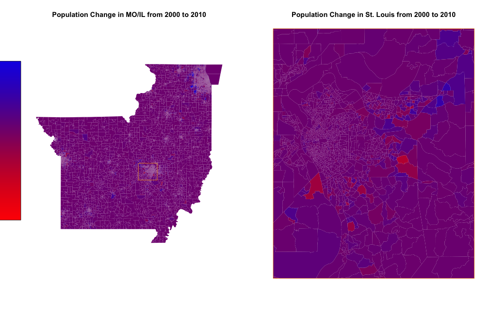
Most population change seem to be from blockgroup level change
The vast majority of change in this chloropleth seems to be within the North-Eastern (particularly in Chicago) part of Illinois, where a large number of people are moving into. Population change in St. Louis seems to be less drastic, with the Illinois side of St. Louis (formally known as East St. Louis) going through more variable change in general. However, there seems to be no interesting trend as to the change in population within St. Louis.
The information gathered in this plot could also be shown in box plots or other similar plots, but without the geographic knowledge gained from a chloropleth. However, as the main point of this plot is to gather geographic information about the change in population over time, any of those plots would be ineffectual toward the ultimate goal of showing change on a geographic level. The color range was chosen by transforming the original data onto (-1,1), then using atan on it, in order to increase the changes closer to 0, as a plot without this transformation included too little detail about the change.